훈스튜디오가 디자인한 LG Display의 Barrot 모델은 급속도로 다문화화되어 가는 현대 사회에서 언어 장벽을 허물고 실시간 커뮤니케이션을 촉진하는 차세대 양방향 스마트 디스플레이 솔루션입니다. 이 제품은 특히 정상회담, 국제 회의, 글로벌 기업의 회의실, 공공기관의 안내 시스템, 다국적 전시회, 공항·호텔의 안내 카운터 등 다양한 공간에서 활용 가능하며, 실시간 통역 및 정보 전달이 필요한 환경에서 그 진가를 발휘합니다.
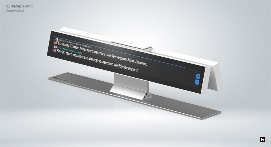
Barrot는 양면 구조의 디스플레이를 통해, 서로 마주보고 있는 사용자에게 각기 다른 언어로 정보를 동시에 전달할 수 있습니다. 예를 들어, 한쪽에는 영어, 다른 한쪽에는 한국어 또는 일본어로 동일한 메시지를 표시할 수 있어 이중 언어 기반의 즉각적인 정보 공유와 실시간 번역 커뮤니케이션이 가능합니다. 이는 기존의 단방향 정보 디스플레이 한계를 넘어서, 실시간 상호작용 기반의 스마트한 사용자 경험을 제공합니다.
이 제품은 특히 정상회담과 외교행사, 혹은 다국적 기업의 중요한 회의 현장에서 즉시 통역이 필요할 경우, 번역된 텍스트 정보를 빠르게 전달할 수 있어 참석자들의 이해도와 회의 몰입도를 높여줍니다. 기존 통역 시스템이 제공하는 음성 통역에 시각적 정보를 더함으로써, 청각적·시각적 정보를 동시 제공하는 복합 커뮤니케이션 플랫폼으로 기능합니다.
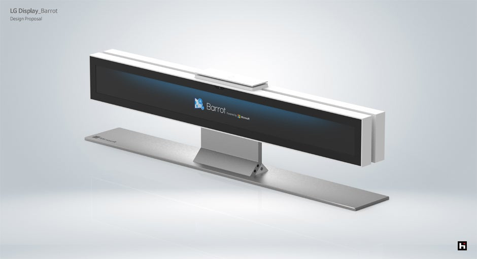
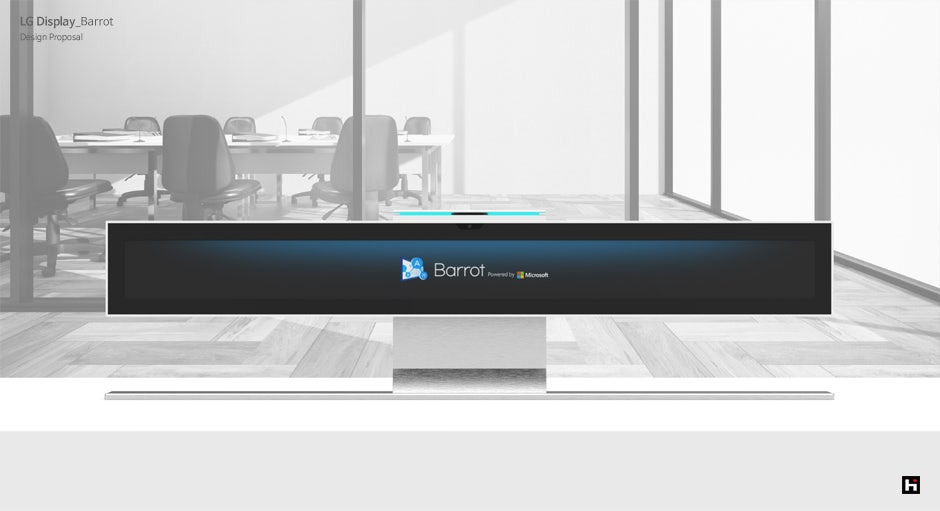
제품 외형은 미니멀리즘을 기반으로 한 직선적이고 현대적인 조형미를 바탕으로, 고급스러운 환경에 적합한 하이엔드 디자인으로 완성되었습니다. 메인 디스플레이는 고해상도 OLED 패널을 적용할 수 있도록 설계되었으며, 화면의 시인성을 확보하기 위해 적절한 각도 조절이 가능한 구조를 채택하고 있습니다. 바디는 무광 화이트 컬러와 메탈릭 실버 소재를 조합하여, 공간과 조화를 이루는 동시에 기술적 신뢰성을 시각적으로 표현합니다.
Barrot는 기술 통합 측면에서도 매우 유연하고 강력한 플랫폼을 제공합니다. 클라우드 기반 콘텐츠 관리 시스템과 연동하여 중앙에서 텍스트를 실시간 제어할 수 있고, 다양한 IoT 장비 및 외부 서버와의 연동도 고려되어 있어 스마트 빌딩 환경에 쉽게 통합될 수 있습니다. 또한 음성 인식 시스템과의 연계, AI 번역 엔진과의 실시간 동기화 기능도 적용 가능하도록 설계되어 있어, 다국적 인원이 함께 있는 공간에서도 자동 통역 디스플레이로 활용할 수 있습니다.
UI/UX 디자인 측면에서도 세심한 배려가 돋보입니다. 디스플레이에 표시되는 텍스트는 언어별 타이포그래피 특성과 가독성을 고려해 자동으로 조정되며, 긴 문장도 화면 안에서 자연스럽게 흐르도록 스크롤 및 페이징 기능이 지원됩니다. 또한 간단한 터치 제어 인터페이스를 통해 디스플레이 방향 전환, 언어 전환, 밝기 조절 등도 손쉽게 조작할 수 있어 운영자의 편의성 또한 높였습니다.
설치 구조 또한 유연하게 설계되었습니다. 기본 스탠드형 외에도 벽면 부착형, 천장 매립형, 테이블 고정형 등 다양한 형태로의 응용 설치가 가능하며, 각기 다른 장소의 설치 조건과 미관을 고려해 맞춤형 솔루션을 제공할 수 있습니다. 후면 포트 구성은 HDMI, USB, LAN, 전원 포트 외에도 무선 모듈이 포함되어 있어 다양한 장비와의 연결이 원활하며, 케이블 매니지먼트 구조로 인해 실제 설치 시 복잡한 배선을 깔끔하게 숨길 수 있습니다.
제품의 기능 확장성도 매우 우수합니다. 필요에 따라 디지털 사이니지, 회의 어시스턴트, AI 키오스크, 공공정보 안내 패널 등 다양한 역할로 전환할 수 있어, Barrot는 단순한 정보 전달 장비를 넘어서는 멀티유즈 스마트 플랫폼으로서의 가치를 지닙니다. 기업이나 기관의 운영 환경에 맞춘 UI 커스터마이징, 언어 추가, 브랜드 컬러 및 로고 삽입 기능도 제공되어, 보다 일관성 있는 커뮤니케이션 환경을 구축할 수 있습니다.
훈스튜디오는 Barrot 프로젝트를 통해 디스플레이 기술이 언어와 문화를 연결하는 글로벌 커뮤니케이션 허브가 될 수 있음을 실현하고자 했습니다. 이 제품은 디지털 기술과 사용자 경험 디자인의 유기적인 결합을 바탕으로, 언제 어디서나, 누구나, 어떤 언어로든 명확하고 신속하게 소통할 수 있는 환경을 제공합니다.
결론적으로 Barrot는 단순한 디스플레이가 아니라, 글로벌 환경에서의 실시간 커뮤니케이션을 위한 핵심 플랫폼입니다. 다양한 언어, 다양한 문화, 다양한 공간 속에서 사람과 사람, 브랜드와 고객, 기관과 시민을 연결하는 스마트한 창구로써, 국제적 커뮤니케이션의 새로운 표준을 제시할 것입니다.
LG Display – Barrot: Smart Bidirectional Display
Barrot, designed by HOONSTUDIO for LG Display, is an innovative bidirectional smart display that enables real-time multilingual communication. Designed for use in international conferences, diplomatic summits, multinational offices, airports, hotels, and public information desks, it bridges language barriers through seamless simultaneous translation display.
Its unique dual-sided screen allows two users sitting face-to-face to receive the same information in different languages at the same time. This real-time translation and dual-view interaction enables more efficient and inclusive communication, especially in multilingual environments.
Barrot combines minimalist aesthetics with premium functionality. Its slim and modern form features a high-resolution OLED panel, adjustable viewing angles, and a blend of matte white and metallic silver finishes for a sleek and professional presence. Designed for integration into smart environments, it supports cloud-based content management, AI translation engines, and voice recognition systems.
In terms of user experience, Barrot features optimized typography for different languages, intuitive touchscreen controls, and a clean cable management system. It offers flexible installation options—freestanding, wall-mounted, or ceiling-integrated—to suit any environment.
Beyond a display device, Barrot serves as a multifunctional communication platform—transformable into a smart kiosk, digital signage, or conference assistant. Its adaptability and customizability make it a global communication hub that fosters inclusive dialogue, bridging cultures and languages in real time.
제품디자인회사 HOONSTUDIO
웹사이트: www.hoonstudio.com
이메일: ratiodesign@gmail.com
전화: 02-6013-1049 / 팩스: 02-6013-1048
주소: 서울시 구로구 신도림동 412-3 신도림팰러티움 102-1303
'PROJECT' 카테고리의 다른 글
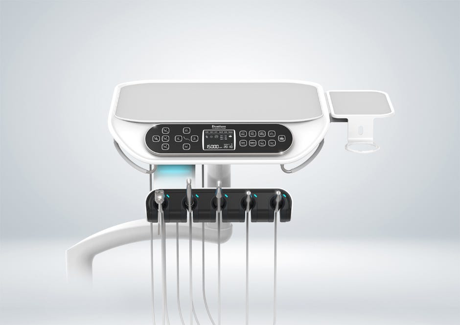
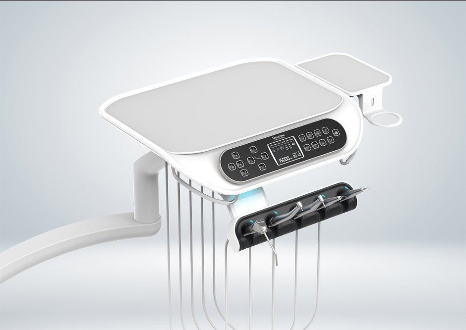
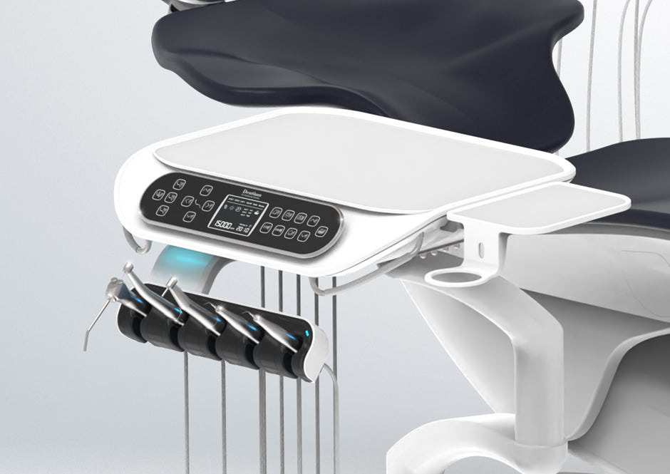
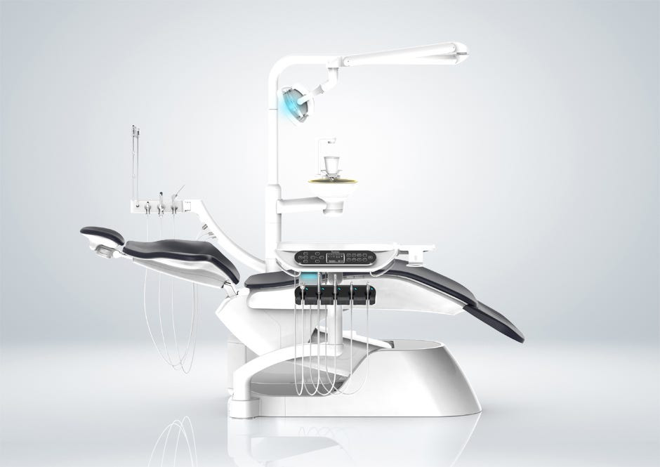
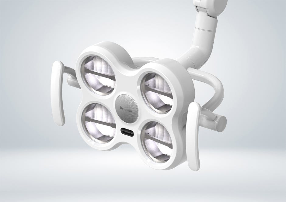
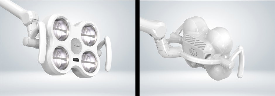
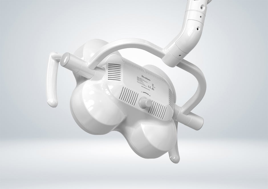
| DENTIUM Dental Table (0) | 2025.05.20 |
|---|---|
| DENTIUM Dental Lighting (0) | 2025.05.20 |
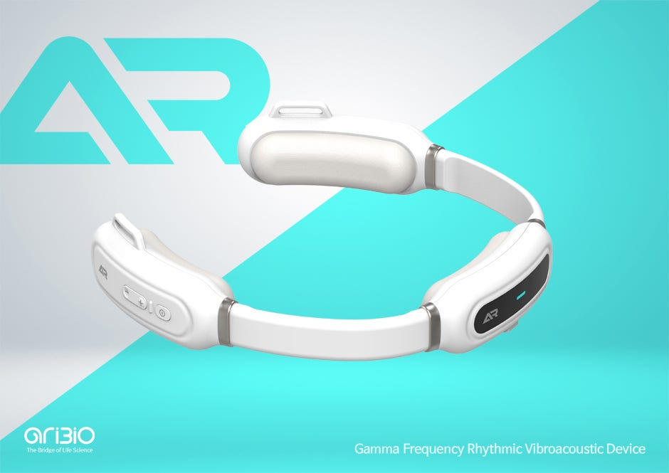
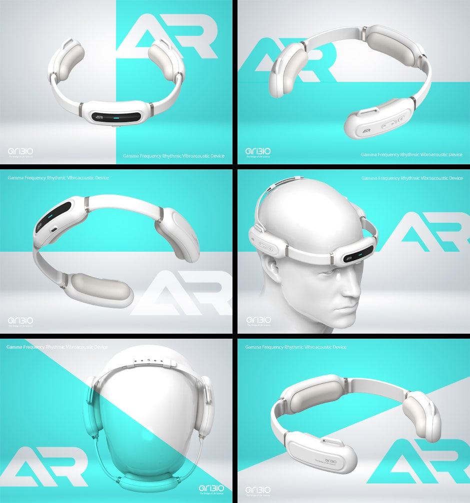
| ARIBIO The Brain Vibroacoust (1) | 2025.05.20 |
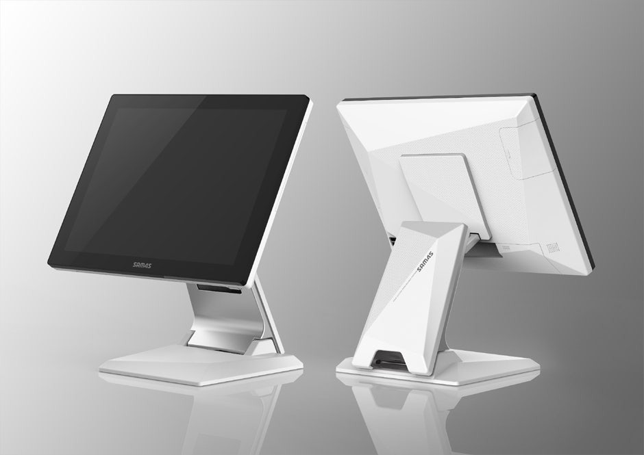
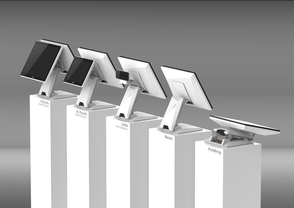
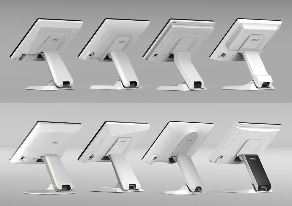
| SAM4S Sapphire POS Terminal (0) | 2025.05.20 |
| AFI_AF120 Pesticide Drone Design (0) | 2025.05.20 |